You are using an out of date browser. It may not display this or other websites correctly.
You should upgrade or use an alternative browser.
You should upgrade or use an alternative browser.
Pictures of different ST police bikes?
- Thread starter Ray
- Start date
MotorSam
I get paid to do this!
Those are nice but not sure about the $$$..seem pricey. Say I was looking at your current avitar observing the "pre" R box bike..then I saw your other avitar.... Ouch...nasty!
 Ouch...nasty!
Yea thats what happens when older citizens see the lights and hear the siren but think they have enough room to turn left in front of ya....and then realize they don't so the stop in the middle of the roadway...it was a lovely flight thought..movie sucked...lol lol
MotorSam
I get paid to do this!
Yea thats what happens when older citizens see the lights and hear the siren but think they have enough room to turn left in front of ya....and then realize they don't so the stop in the middle of the roadway...it was a lovely flight thought..movie sucked...lol lol
Been on the same flight...same crappy movie too! :crackup
Shadowfax-ST
As ridden by Pat
Needs polish (exhaust). Just sayin', Officer
MotorSam
I get paid to do this!
Those are good...but THESE are more relative!
http://www.flickr.com/photos/12721752@N05/tags/hondapolicemotorcycle/
http://www.flickr.com/photos/12721752@N05/tags/hondapolicemotorcycle/
- Joined
- Dec 1, 2004
- Messages
- 13,294
- Age
- 61
- Bike
- '21 RT / '24 GSA
Those are good...but THESE are more relative!
http://www.flickr.com/photos/12721752@N05/tags/hondapolicemotorcycle/
There was an off road course?

MotorSam
I get paid to do this!
There was an off road course?
Must be a Florida thing!
"Flickr" is a great site for ST-P's...and this Rivarix captures great competition shots...
Here are some shots my wife took today, during a bicycle race (wielerwedstrijd).
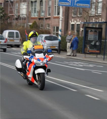
Police ST with mine parked
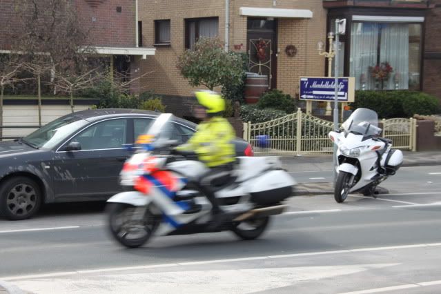
The police of the Hague are one of the few forces in the Netherlands who use ST1300's.
Today they had over 14 ST's running around and one R1200RT. And an unmarked R1200GS, btw

Police ST with mine parked

The police of the Hague are one of the few forces in the Netherlands who use ST1300's.
Today they had over 14 ST's running around and one R1200RT. And an unmarked R1200GS, btw
Last edited:
And I found these 2006 shots from the city of Amsterdam, during the marathon:
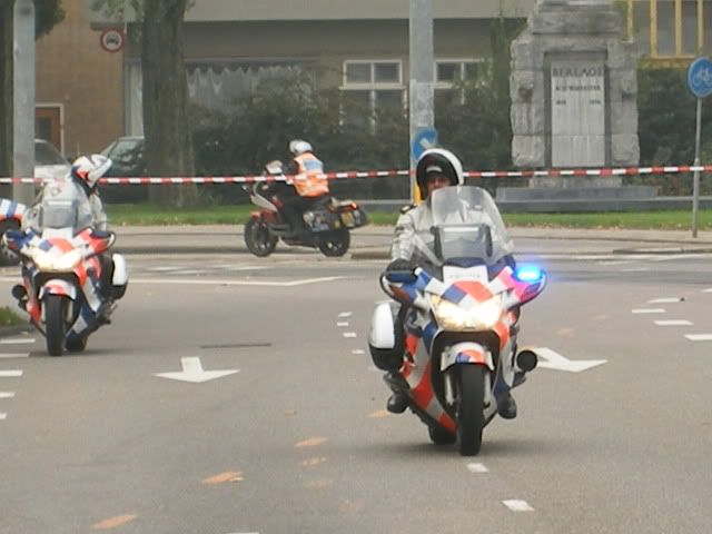
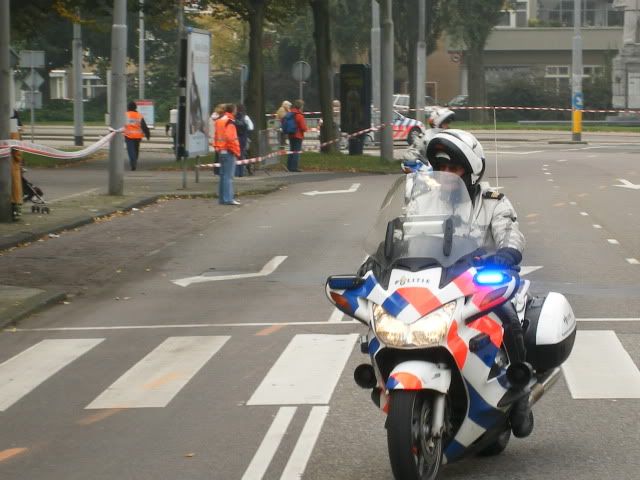
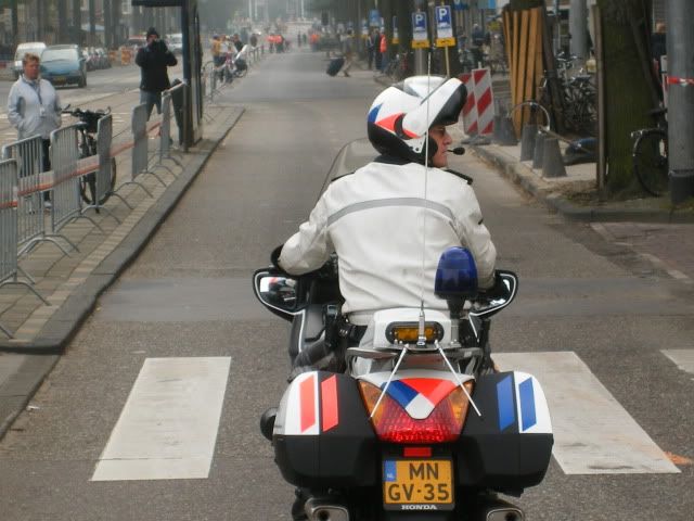


Shadowfax-ST
As ridden by Pat
Quite a livery - right up until you see the lazy applications to the rear of the luggage...
MotorSam
I get paid to do this!
Nice shots...you can see them coming...even without their emergency lights on!
Quite a livery - right up until you see the lazy applications to the rear of the luggage...
The whole livery is closely defined for all police vehicles. The odd stripes on the rear are part of this. You can see the same markings on this K1200RS:
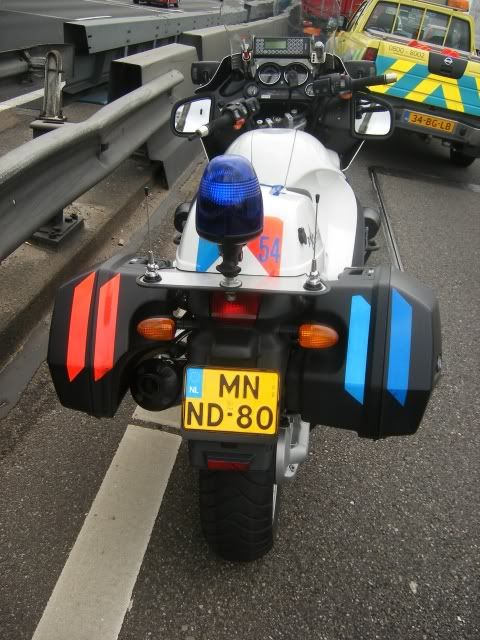
Better than nothing, but not on par with the UK rear markings.
Shadowfax-ST
As ridden by Pat
Just reflecting on that cross stripe pattern.
I recall the research in early WW1 (Wikipedia) that resulted in battleships having the most bizarre liveries of stripes, cuboids, and 'flashes', which were designed to confuse the enemy about their range, direction, and scale. That's similar I expect to the theories of zebra and tiger stripes; zebra confuse vision when in groups and tigers just blend into even quite contrasting backgrounds.
So should a motorcycle employ stripes?
I'm certain they are of sufficient contrast to to be seen by people with colour-perception difficulties (odd though to use orange, which is actually a high risk but much of Europe uses it) but the idea of their camouflaging the bike's range, direction, and scale and therefore, closing speed might be something to ease out of my enquiring mind by reading the research this livery based on?
These are colour-blind simulations from Vischeck. Suddenly things look less 'different'?
That aside, I still like it. It's 'attractive' which is what it's all about at the end of the day, and it looks even smarter when there's a pair of them - but then, I think back to zebra and battleships and start the whole worry process all over again...
...then again, compared to painting a Sherrif's bike dark green this is Starship Enterprise in the timeline of visibility! ( 'Morning Sherrif

I recall the research in early WW1 (Wikipedia) that resulted in battleships having the most bizarre liveries of stripes, cuboids, and 'flashes', which were designed to confuse the enemy about their range, direction, and scale. That's similar I expect to the theories of zebra and tiger stripes; zebra confuse vision when in groups and tigers just blend into even quite contrasting backgrounds.
So should a motorcycle employ stripes?
I'm certain they are of sufficient contrast to to be seen by people with colour-perception difficulties (odd though to use orange, which is actually a high risk but much of Europe uses it) but the idea of their camouflaging the bike's range, direction, and scale and therefore, closing speed might be something to ease out of my enquiring mind by reading the research this livery based on?
These are colour-blind simulations from Vischeck. Suddenly things look less 'different'?
That aside, I still like it. It's 'attractive' which is what it's all about at the end of the day, and it looks even smarter when there's a pair of them - but then, I think back to zebra and battleships and start the whole worry process all over again...
...then again, compared to painting a Sherrif's bike dark green this is Starship Enterprise in the timeline of visibility! (
Last edited:
Re: Anyone have some pictures of different ST-1300 police bikes?
I'm considering "dressing up" my black '06 and I agreed with you that the checkering on those police ST's was about the sharpest design idea I've seen yet. You wrote that you were considering doing something similar to yours. Did you? and if you did, could you post some pics? Thx.
This is my personal favorite. I'm considering doing something similar on black but with white reflective checkered.


I'm considering "dressing up" my black '06 and I agreed with you that the checkering on those police ST's was about the sharpest design idea I've seen yet. You wrote that you were considering doing something similar to yours. Did you? and if you did, could you post some pics? Thx.
\\Just reflecting on that cross stripe pattern.
I recall the research in early WW1 (Wikipedia) that resulted in battleships having the most bizarre liveries of stripes, cuboids, and 'flashes', which were designed to confuse the enemy about their range, direction, and scale. That's similar I expect to the theories of zebra and tiger stripes; zebra confuse vision when in groups and tigers just blend into even quite contrasting backgrounds.
So should a motorcycle employ stripes?
I'm certain they are of sufficient contrast to to be seen by people with colour-perception difficulties (odd though to use orange, which is actually a high risk but much of Europe uses it) but the idea of their camouflaging the bike's range, direction, and scale and therefore, closing speed might be something to ease out of my enquiring mind by reading the research this livery based on?
These are colour-blind simulations from Suddenly things look less 'different'?
[
That aside, I still like it. It's 'attractive' which is what it's all about at the end of the day, and it looks even smarter when there's a pair of them - but then, I think back to zebra and battleships and start the whole worry process all over again...
...then again, compared to painting a Sherrif's bike dark green this is Starship Enterprise in the timeline of visibility! ('Morning Sherrif

Took me quite some time to respond to this, I apologize for that. However, some time was spent on trying to find research relating to the dutch striping..
Anyway, the current dutch striping was created by a private studio. It was created when the two separate police forces in the Netherlands were restructured into the current police force. This was around 1993. The design studio (studio Dumbar) designed the force logo and also the vehicle striping. According to an interview I found, the striping was formed primarily for providing a corperate image.
here is the studio: http://www.studiodumbar.com/main.php (click: projects>visual identity>dutch police force)
Here is a good example of marked cars:
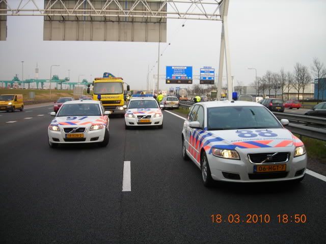
and a pair of Honda's
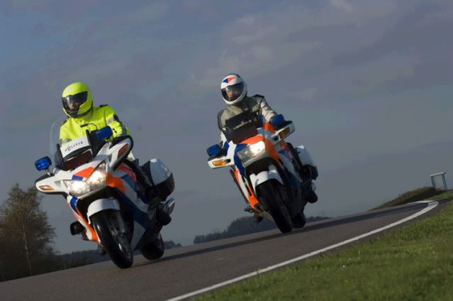
The orange colour is a traditional police colour in the Netherlands (and the rest of the Benelux as well btw).
Before 1993 the Rijkspolitie (state police) had BMW's with full orange fairings. Extremly bright.
Interestingly, (and IIRC) the document that describes the current striping for UK motorcycles mentions that conspicuity whas the target, rather than the corperate image.
And yes, the euro approach to police markings is rather different than most US markings
Share:


